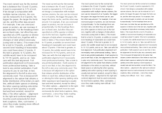
We were asked to look at hierarchy within writing a proverb, this is my attempt.
We were given a paragraph of text and asked to fit it into the first column, everyone came out with different sizes and leading, these are my attempts, after alterations my second one fits better.
We then had to copy and paste the same text into each of the columns keeping the font the same. We had to fit the type to each of the column but decrease the font size by one point each time. To make it fit we had to adjust the leading.
Graham suggests to do 11 point on 13.2 leading for the first column and decrease point size from there.
We printed out our columns and decided as a group that the second column was the most legible.
We took the 2nd column of text and copied in into a new document, we then copied it into one column, then into two, then into 3, then into four.
I think and most other people think the 3rd column is the most legible. when you read it aloud the sentences flow best.
The first column is not really seen in print, the second one is seen in a newspaper and the third one is seen in magazines.
5 or 6 words a line. 36 characters, is the minimum words a line for legibility. The maximum is 11 to 12 words, 72 characters, per a line.
We copied our second column changed the font on each of the paragraphs.
And we did the same again and changed the weight of the same font.
We now have a new paragraph of text and had to fit it to the column, the size is 9 point on 11.35 leading.
To try and make the text larger we get rid of the spaces in the text and indent the paragraphs instead. The text is now 9.3 point on 11.35 point.
Never do negative leading.
3 characters is the general size you should indent a paragraph.
You will never have an indent and a line space at the same time in design.
We got a new piece of text and we had no rules this time and had to make it fit within the page, to make it fit and make it mots legible I looked at point size, type face, leading.
We then had to add a picture into the page.


No comments:
Post a Comment