
Thursday, 29 March 2012
Wednesday, 28 March 2012
Dreamweaver Workshop-Session 1
-Todays Aims
1.Identify purpose of website.
2.Identify and distinguish the target audience.
3.Identitfy and evaluate the target audience needs.
4.Demonstrate understand of interface design and basic layout techniques.
-PPD Task 6-Spreading the Word.
-Purpose of having a website-
accessibility, potential clients, showcase portfolio, practical, self promotion, get a job, freelance
-Target Audience-
Potential employers, clients, collaborators, like minded people, awards
-Audience Needs-
contact info, examples, awards, CV-------Pages.
-Go and talk to target audience.
-Look at similar websites.
-Websites
-3 to 5 seconds is the average time people will use to judge a website, before they decided to stay on it or not.
-apple.com
white
clean
clear
structured
-myownbike.de
bicycle
simple
modern
professions
-slaveryfootprint.org
flat
provocative
minimal
google-colour scheme
misleading
no clear navigation
-2009.legworkstudio.com
too long to load
illustration
clutter
handmade
arty
childish
-nolimitarcades.com
load
abrasive
crap
old
techie
busy
overcrowded
-evangelcathedral.net
busy
tacky
busy
noisy
over baring
confusing
too many navigation buttons
-vickiandlaura.co.uk
horizontal scrolling-wanted to create a journey
-Scamp-hand drawn layout of website
site map-what pages link to each other
-Designing a Website
1.Homepage
3.about
4.contact
2.work
-Working on a ratio of 800 to 600
-Websafe colours
when using Photoshop open colour picker and choose web colours only.
-Websafe fonts
You specify a font family not just one font
If you want to use a font that isn't web safe you have to make an image
-800x600 will fit on any screen
Use 1024x768
-Adobe Flash doesn't work on Apple Systems.
-Managing content on website by CMS- Content Management System
-CushyCSM.com

Tuesday, 27 March 2012
Bottles In Context


On our previous boards we had done that but only with the Photoshopped bottles we had made up,
once I had taken photos of the actual bottles I had made up I drew up a scene on Illustrator and placed our product in the scene where we think it would be sold.
Bottle Labels

These are our final label designs, I printed them out onto acetate as we wanted them to be clear and the colour of the drinks make up the background colour of the labels.
This is what they look like on the drinks,
Monday, 26 March 2012
Bottle Re-Design


down the colour as people said it was too harsh and we weren't
entirely happy with how they turned out.
We liked the side on design of the fruit with the side
on text so developed that idea...

drink formed the background colour of the label, we are going to
try printing the label onto acetate to see how it looks around
the bottles.


Bottles in Context


and drinks in context from where they would be sold out in the real world.
I have mocked up where they would be seen in a shop and how you might
receive it if you bought it in a cafe.
Phone App Design

This is the initial phone app design that Emily and I worked on.
It needs improvement but we have our basic idea down and what
we want each part of the app to show.
Thursday, 22 March 2012

Wednesday, 21 March 2012
Spirographs to Screenprint


I have done some simple, one layer spirographs that I am going to expose onto a screen to layer up when I screen print them.
I am going to try different colours and shape combinations to see if I can get more effective spirographs then when using the actual spirograph itself.
Tuesday, 20 March 2012
Napkin Designs
Here are some mock ups of how we could promote Feel Good Drinks on napkins. Their logos could be put on napkins so that when people buy their lunch at the delis and cafes where Feel Good Drinks would be sold they could be promoting themselves to their main target audience.
Bottle Design


the whole fruit cut in half. By using the drawn fruit instead
of a real fruit gave the bottles a fun fell which is the tone of voice
Feel Good Drinks want us to use. This design feels a lot crisper and cleaner
than the previous ones and conveys the element of freshness we want to project.
Fruit Photoshoot
the Feel Good Drinks we are focusing on. We will potentially use them on
the packaging/posters to promote the freshness of the drink.
Bottle Designs


Emily and I mocked up these bottles today from drawings and designs we had both done,
after we had mocked them up we realised that the design didn't really work. We felt something
was lacking and it didn't stand out how we wanted it too. So we went on to re-design another idea.
Spirographs


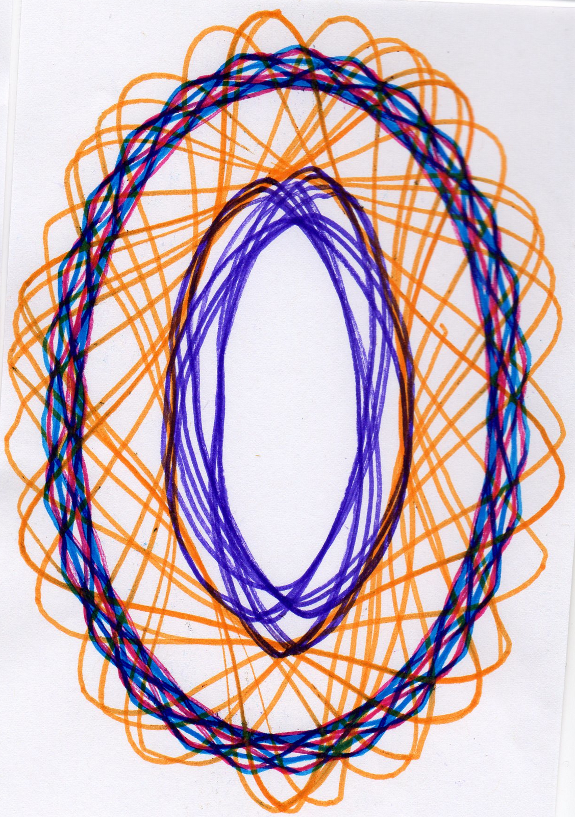
I tested out some spirographs today, its a lot harder than it looks/I remember. But I like the idea
of the layering and build up of shape and colour.
Monday, 19 March 2012
Image...Erik Kessels D&AD Brief Resolutions


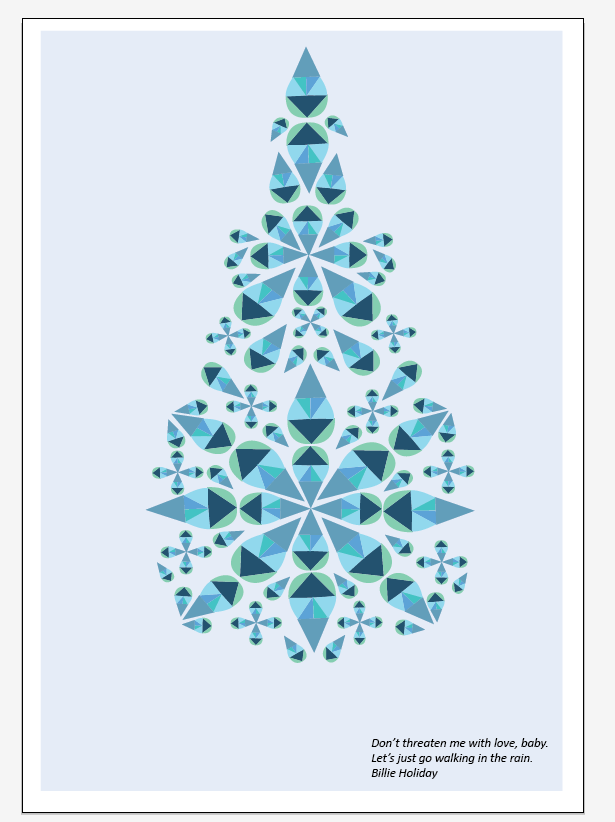
These are the final resolutions in response to the Erik Kesselss brief, I have tried a few
different layouts and designs but I think I am going to submit the one on the top left
with the writing in the top left corner and the three droplets. The three droplets give the
poster more of a sense of dimension.Feel Good Drinks...Logo and Typeface


We have got hold of the typefaces and logo we need to put on our designs.
In the end we didn't have to pay for the typefaces we found them online for
free.
Now we can apply the logo and typefaces to our designs.
Image...Erik Kessels D&AD Brief


For the Erik Hessels brief for D&AD we have been asked to focus on rain, I am putting a
quote on my poster and this is the beginnings of the image that will go along side it. I am working with the basic shape of a rain drop and making a pattern from it, making rain seem attractive which is what the brief is asking us to do.
Spirograph
Sophie was kind enough to bring in her spirograph for me to play with,
it is definitely harder than it looks!


I am going to take my spirograph images and screen print them, this way I can layer them and it will probably turn out better than if I used the actual spirograph.
it is definitely harder than it looks!


I am going to take my spirograph images and screen print them, this way I can layer them and it will probably turn out better than if I used the actual spirograph.
Bottle Design


Subscribe to:
Posts (Atom)