
Showing posts with label Brief 5-InPress. Show all posts
Showing posts with label Brief 5-InPress. Show all posts
Tuesday, 11 December 2012

Final Boards
These are my final 6 boards ready for submission, my 4 main briefs have been printed out and the Neon Cactus and Tigerprint brief are just going to be submitted in PDF format.
Monday, 10 December 2012
Briefs
These are my 4 main briefs and below are two smaller briefs that
I have worked on during this module, one is a live brief and the other
a competition brief.


Sunday, 9 December 2012
Photographing Final Products
Kirsty and I rented out some photography equipment to photograph our final products ready to go on our boards. we had had a photography induction the week before so we knew how to use all the equipment.
These are the best images of all my final products that I am going to use on my final boards, it was good to learn how to use all the equipment properly as a photograph can make or break a product.
Monday, 3 December 2012
Inpress Event at Dock Street
We had our event over the weekend at Dock Street Market, the opening night was
on the Friday where we had the live band the Crash Blossoms and then the
shop was open for the rest of the weekend.
We had Form and Writing and James Murphy as our guest designers,
it was a really successful night, we had a lot of visitors, some that we knew
and some new faces that we hadn't met before.
It was also Form and Writings first event so it was a good platform for them
to get themselves and their work known.
It was great to get my new work out there that I had been working on
this term, I explored a lot of knew print processes and it was good to
talk to people about them and how I had produced the work.
Thursday, 29 November 2012
Inpress Packaging for Event
These are the bags that were made for the event to be used to put the prints that people purchased at the event in. They were
sustainably sourced as they wer emade from recycled newspapers, the blue and red colours, in keeping with the branding, were
screenprinted onto the bags and then the Inpress logo was stamped on top of that in white ink.
The packaging was made in a similar way to the bags, they were sustainably sourced using old newspapers and then hand folded and bound so that postcards that had been designed by each member of Inpress could be slotted in and sold as a set. Like the bags the colour was screenprinted over the top and then the Inpress logo stamped over the top in white ink.
Tote Bags


For Inpress I also did some fabric screen prints onto tote bags, I did some
illustrations of fruit, therefore this is the 'Fruit Salad' bag, I am going to sell
the bags for £5, that way I should make my money back that I spent
on the printing and bags themselves.
Marmite Prints


For our Inpress event I have been doing some different types
of print, these are my paper A3 screen prints of Marmite illustrations
I had done. I wanted to take the image of Marmite and change it using
colours that would never been associated with Marmite at all.
I am unsure about how much to charge for them at the moment
but I think about £3.
Etching
I wanted to try out some new printing methods and learn some
new processes as part of the Inpress brief, as we are a print based
studio I think its important that I can learn and know as much about
print as I can.
I went down to Vernon street and made an etching plate and Neil
helped me out and showed my how to print using my copper
etching plate.
I will definitely make more etchings now I know how to, I really
enjoyed the process, I would like to take it further and try
aquatint as well.

new processes as part of the Inpress brief, as we are a print based
studio I think its important that I can learn and know as much about
print as I can.
I went down to Vernon street and made an etching plate and Neil
helped me out and showed my how to print using my copper
etching plate.
I will definitely make more etchings now I know how to, I really
enjoyed the process, I would like to take it further and try
aquatint as well.

Saturday, 24 November 2012
Inpress Stamp

Our new Inpress stamp arrived! Ready to stamp
all our packaging and prints for our next event!
Inpress Promotion


These are our final printed promotional flyers and posters,
we used images of our work and events on the background
of both and then screen printed the information over them.
Event is next week so need to crack on and get everything done
in the next week!
Wednesday, 21 November 2012
Inpress Postcard

For our Inpress Event we are all making a postcard which will be sold
as a set, it is part of our promotional material so people can have something
that is designed by each one of us, showing our different styles within the
design studio.
This is the image I am going to use on my postcard, I drew the images over the
summer and haven't had a chance to apply them to anything yet. I am going to
digitally print them.
Printing Inpress Posters
Sadie and I finished the design for the Inpress promotional posters so
we go printing. We digitally printed the background images onto newsprint
and then screen printed the text over the top in the same colours as out business cards
to keep consistency across our branding. We tried doing some florescent green ones
but the smaller type wasn't very legible to we decided to to use the green.
We are doing the same on a smaller scale for the flyers.
Wednesday, 7 November 2012
Promotion Design Development
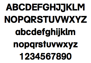
Matilda type face along side AG Schulbuch BQ, which is the typeface
we used for our logo and publication...
are just initial ideas to show the type of thing we want to produce.
The colours will match the colours used on our business cards and will
be screen printed over the digitally printed greyscale images and then
spot varnished.
We are also yet to decided on which background images to use, the designs
above show different images on different layout, we are going to ask for feedback on them in our crit tomorrow.
Form and Writing's type face for inpress
Form and Writing have designed us a type face that we are
going to be using on our promotional posters.
Its called Matilda,this is a preview of it...


going to be using on our promotional posters.
Its called Matilda,this is a preview of it...


Stock Choices


The images we are using on our background image design are all greyscale as the
spot colour will be used for the type and screen printed over the top.
We tried printing it on different stocks, all which were off white or grey as we didn't
just want to have a white background. We haven't looked at the weighting of
the stocks yet, we are focusing on the colours first.
The light grey stock worked the best with the greyscale images, we need to try
it with the bright colour type over the top as well.
We are going to take these designs to our crit and get some feedback on what works
best.
Inpress Images
We went through the photos we had of our past events and work
we had done, we picked a few that we thought show off who we are
and what we do the best. We changed the images to greyscale to
be used on the background of our promotional material, they will need
to be edited further before we go to print.
Inpress Promotional Material Initial Ideas


Sadie and I are doing the promotional material for our next inpress
event at the end of the month.
Form and Writing are designing us a type face to use so we are going
to make it the main focus of the promotional material.
We are looking to design flyers and posters, as well as stickers
and social media.
Subscribe to:
Posts (Atom)