Monday, 22 November 2010

No News Is Good News-Posted Mail Shot


This is my mail shot that went through the post, it arrived at college undamaged and still in tact!

Monday, 15 November 2010

No News Is Good News-Envelope Designs


 I wanted my envelope design to open up to reveal something, from my experimenting with paper folding I liked this envelope the best, I started using this net to make envelopes that related to my subject so started to look at the map of Iraq.


 I used Illustrator to draw out the map of Iraq, I put in name places as when I used just the shape of the country people were unsure what it was. I have made the envlope double sided so the map is on the outide and also on the inside when you open it up to read the message.


No News Is Good News-Ideas


These are some of my design sheets, I have started to look at different folds of envelopes that could be appropriate to the message I want to send out. I then started to think about what was going to go inside my envelope and different ways that it could be presented, experimenting with colour anf type.

Wednesday, 10 November 2010

No News Is Good News. Message and Delivery


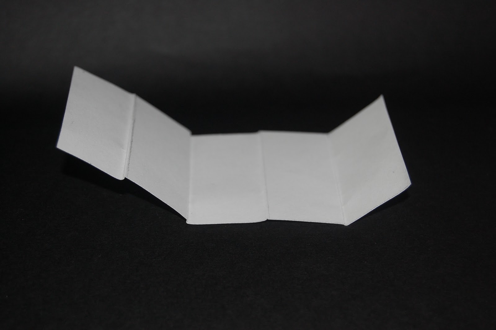
 For the second part of the No News is Good News brief we have to prodice a mail shot which has to be 160mmx105mm. It can however fold out to a bigger size it just has to be able to fit into an envelope in those dimensions. I have started off by looking at different ways of folding paper so that my mail shot could open out into something bigger.

No News Is Good News-Ideas


Tuesday, 9 November 2010

Colour Theory


This week for Visual Thinking we were all asked to bring in 10 objects of a certain colour we were given, I was given green. We had a talk about colour theory, learning more about primary colours, secondary colours and tertiary colours. We then had to organise our coloured objects around the table to create a colour wheel, the colours opposite each other in a colour wheel are complimentary colours, our colour green in complementary to red. We had to oraginse our colours in chromaticvalue so each hue merged into the next hue around the colour wheel.


We then started to look at the Pantone colour system and the swatch books they produce. 


Using the swatch books we started to find the colours that matched up to some of our green objects.