
Showing posts with label Brief 4-Precious. Show all posts
Showing posts with label Brief 4-Precious. Show all posts
Tuesday, 11 December 2012

Final Boards
These are my final 6 boards ready for submission, my 4 main briefs have been printed out and the Neon Cactus and Tigerprint brief are just going to be submitted in PDF format.
Monday, 10 December 2012
Briefs
These are my 4 main briefs and below are two smaller briefs that
I have worked on during this module, one is a live brief and the other
a competition brief.


Sunday, 9 December 2012
Photographing Final Products
Kirsty and I rented out some photography equipment to photograph our final products ready to go on our boards. we had had a photography induction the week before so we knew how to use all the equipment.
These are the best images of all my final products that I am going to use on my final boards, it was good to learn how to use all the equipment properly as a photograph can make or break a product.
Precious T-shirt


I didn't have any images of the precious T-shirt in context on a person,
I needed to get some images of it for my final boards, so the lovely Niall stepped in as a model.
Each member of pressures has one of these T-shirts, that they can wear events and uses promotion.
Also so the next exhibition I propose that we sell these T-shirts to members of the public,
as people have been interested in them in the past.
Saturday, 8 December 2012
Precious Pencils
To go with the Precious re-brand and stationary I ordered some
personalised pencils with the Precious name on it, with the pink
and gold colour scheme.
For future events I am going to order more so we can give them/sell
them at exhibitions and use them as promotion.
Precious Letterheads
As part of the Precious re-brand I wanted to design some letter heads
that Precious could use and send out to clients.
I wanted to keep it all consistent with the branding so worked with
the pink and gold colour theme again.
Precious don't take themselves too seriously and have a fun feel
to everything they do so I decided to go all out and use pink stock
with gold foiling for all the text.
I used the same typeface on the letterheads as I had done on the backs
of the business cards. I also foiled the whole of the back of the letterheads, compliment slips and inside of the envelopes, I am proposing that if they were mass produced I would use a gold stock instead of foiling to save on costs.

Thursday, 6 December 2012
Precious Letter Heads
I have been testing layouts for the Precious letter head, I want to keep
it simple as the stock is going to be pink and gold so don't want to add
too much information and make it too busy.

This is the layout that I am going to use for the final letterhead and then
reduce it down for the compliment slips.

Monday, 12 November 2012
Precious T-Shirts


Precious have an event tonight and wanted new T-shirts printed for it,
our old ones had gone discoloured and also have our old name Emblemen
printed on them. These new ones were just kept simple, Rosie and I
screen printed gold, with metallic binder onto pink T-shirts, which were
the same colour as our business cards.
The gold has come out really strong so I am pleased with how these turned out.
Final Precious Business Cards
The pink stock arrived so I could start printing and putting together the Precious
Business cards as they needed them for an event on Monday.
I got the backs printed straight onto mount board in digital print.
I printed the logo onto the pink stock then gold foiled it, the foil didn't
come out exactly as planned but I still gave a good effect.
These are the final put together cards, I am pleased with how they have turned out,
I think for the future I will print the backs onto slightly thinner stock and also
emboss as well as foil the logo but as the needed them by Monday I left out
the embossing for time reasons.
I think for the future I will print the backs onto slightly thinner stock and also
emboss as well as foil the logo but as the needed them by Monday I left out
the embossing for time reasons.
Business Card Mock Ups


I have the three different logo ideas for Precious and am still unsure
which one to go with so I decided to mock up each of them to see
how legible each one was at business card size and see how much
of the detail will get lost.
I am going to take them to the crit and ask people which they
prefer, the pink stock should arrive tomorrow too so after my crit
I can get on making the final cards.
Wednesday, 7 November 2012
Precious Logo Development
I have taken the Precious logos I was drawing yesterday and put them
on the computer. I have asked the members of Precious for some feedback.
Some like the original logo, some with the gems. Some feedback I got was
to put the gems on an angle like the type, I have also played around with size.
An issue that may arrise from using the gems on the logo is that when they are scaled
down to business card size they may loose their detail.
I am going to hav a go printing and foiling the different designs and see
how they turn out.
Tuesday, 6 November 2012
Stock for Precious Business Cards


For the fronts of the Precious business cards I am ordering this candy pink
stock from Paperchase, its 175gsm and I am going to foil the logo onto
the front.
I am also going to do the text on the back on white mount board
so they will be put together to produce the business card.
Precious Logo
The guys at Precious wanted to keep their logo pretty much the same,
however I thought I would play around with some typefaces and imagery with
the logo to see if they preferred any.
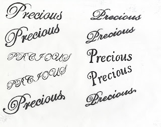

I personally like the logo with the gem added onto it, but have sent them
through to Precious and asked them to decided on one they liked the best
and that is the logo I will take forward onto the designs.
however I thought I would play around with some typefaces and imagery with
the logo to see if they preferred any.


I personally like the logo with the gem added onto it, but have sent them
through to Precious and asked them to decided on one they liked the best
and that is the logo I will take forward onto the designs.
Friday, 26 October 2012
Transfer Paper

My transfer paper arrived but unfortunately too late to make my print
slot I had booked so I have re-scheduled it for monday which will give
me time to get all my designs ready over the weekend.
The packaging for the paper is definitely very interesting....
Writing to David Shrigley
Last night at Creative Networks David Shrigley was the guest talker,
as Precious we are a fan of his work and decided we would write him
a letter to give to him asking if he would write the forward for our next event,
we thought we might as well, we had nothing to loose.
We thought we couldn't just give him a boring letter so we decided to make it
a bit more 'Precious'....

We didn't want to make it to formal and serious, his work always has a
lighthearted theme and so do we as Precious,

This is the envelop we put it in, Pink to reflect Precious' branding and gold
foil on our name.
Hopefully he'll remember us and get in touch!
as Precious we are a fan of his work and decided we would write him
a letter to give to him asking if he would write the forward for our next event,
we thought we might as well, we had nothing to loose.
We thought we couldn't just give him a boring letter so we decided to make it
a bit more 'Precious'....

We didn't want to make it to formal and serious, his work always has a
lighthearted theme and so do we as Precious,

This is the envelop we put it in, Pink to reflect Precious' branding and gold
foil on our name.
Hopefully he'll remember us and get in touch!
Tuesday, 23 October 2012
Precious Pencils
As well as the bags and t-shirts I also thought about having personalised
Precious pencils to sell at the exhibition.
I also thought about badges, both could be sold and also act as a means
of promotion.
I have looked at a few different websites and I am waiting to hear back on some quotes.
I also thought about using the technique I am using for my surface pattern brief
and printing the logos and personalising them myself.
Precious Bags
I haven't given much thought to the Precious brief yet as on my timetable it
dosen't start until next week. However I have been thinking of possible ideas
whilst working on my other projects. The t-shirts we had at our last event where
a hit and everyone wanted one, so this time I thought we could sell the t-shirts
and also sell some tote bags.
I have had a look around and clever bagger seem to be a good company to
get them from, they are cheap and can be bought in small and larger quantities.


dosen't start until next week. However I have been thinking of possible ideas
whilst working on my other projects. The t-shirts we had at our last event where
a hit and everyone wanted one, so this time I thought we could sell the t-shirts
and also sell some tote bags.
I have had a look around and clever bagger seem to be a good company to
get them from, they are cheap and can be bought in small and larger quantities.


Subscribe to:
Posts (Atom)